Located in Metro Vancouver, Canada, Options Solutions is a full-service educational consulting company that empowers students to pursue their academic goals. Their main areas of expertise include post-secondary advising for Canada, USA, and the UK, adolescent interest exploration, writing support and group educational support services. Options Solutions came to Hammerhead looking to for help with brand development.
The Challenge
Due to its history, success and personality, Options Solutions felt that its current brand wasn’t accurately reflecting who they were—it felt outdated and uninteresting. Our challenge was to breathe a new life into the brand and its website, while keeping much of the brand equity current students and parents know and respect.
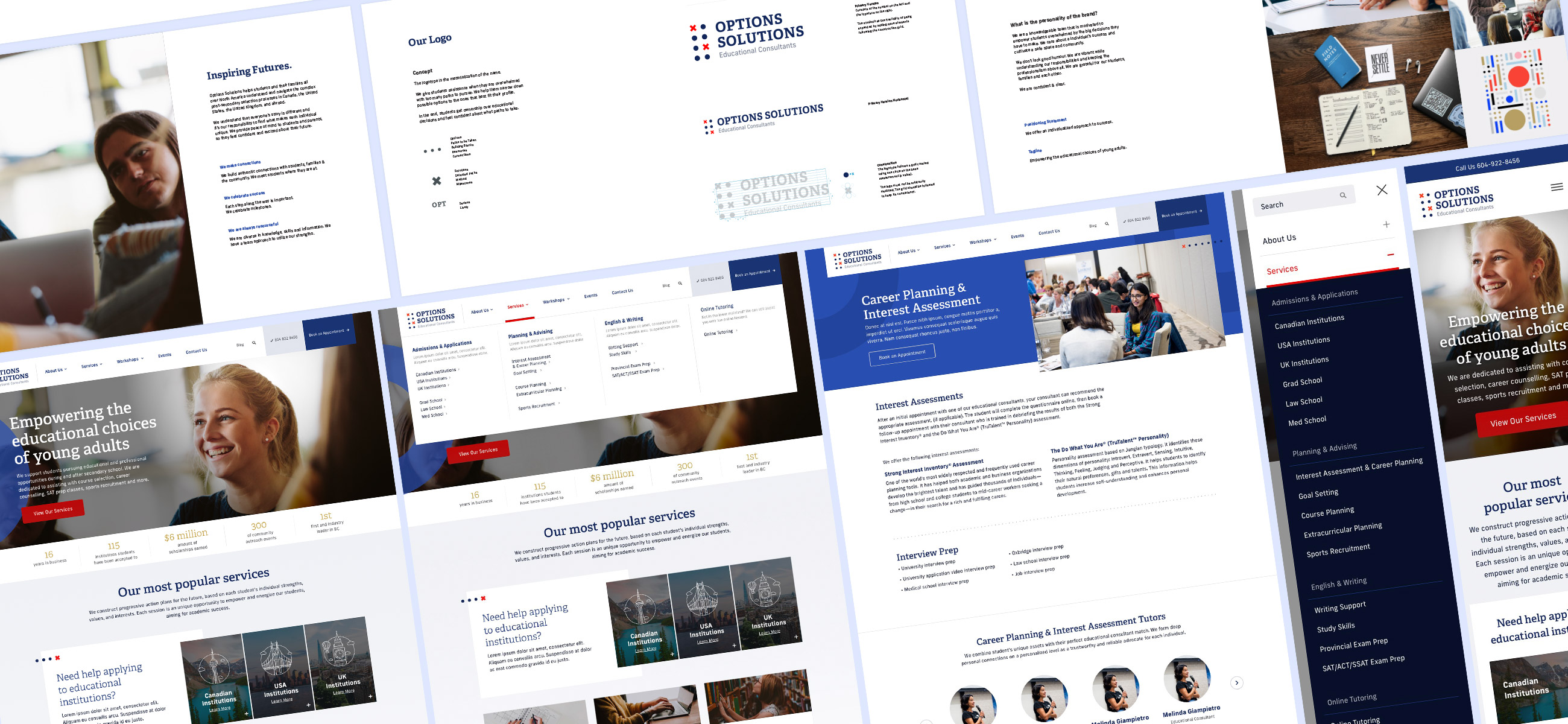

Our Approach to a Brand Refresh & Website Design
We came up with a new brand and website to better fit Options’ needs. The project was divided into two phases: branding and website redesign. Each phase had the following steps: discovery, definition, ideation, building and measuring, which were handled using the Agile methodology as much as possible to speed up the process. Every pixel and decision was laid out following the data we had carefully gathered and based on collaborative discussions with the client.
Services Rendered
Brand Development
- Discovery
- Audience Report
- Moodboards
- Visual Identity Concepts
- Branding Guidelines & Design Handoff
WordPress Website Development
- Discovery
- Analytics Report
- CMS Setup & Advanced Functionalities
- Visual Design
- Design and CMS Integration
- Pre-launch SEO
- Quality Assurance
- Launch
- Hosting & Maintenance


Rebranding
Speaking to the Right Audience with a new Brand Personality
We set up search console, analytics & heat maps on the website and reviewed all data to determine key information about the audience. Finally, we conducted a survey of staff, students, and parents to gather information where we identified gaps in our data. With such information in hand, we defined what kind of goals people had while accessing the website, what kind of websites can be used as a reference and what motivates them to approach an educational consultant.
University application is a pivotal point in a young adult’s life. Our audiences know that decisions made from grade 9 -12 can set the stage for their college and careers.
The brand as a whole should speak to parents and students with a knowledgeable, friendly and caring tone while keeping itself professional. We needed to make sure Options could be perceived as a trustworthy organization, someone that has your back and knows how to navigate the complex educational system. However, the brand tone needs to be attached to specific images and elements. To define the brand personality using images, we used moodboards.
Using the brand tone and values as a guide, we began putting together three distinct moodboards (showing 3 different personalities, from the most imaginative and friendly to the most professional and rigid). The boards were discussed with Options Solutions and it was determined that the brand personality should be a combination of two of them. A fourth, final board was created and approved. This determined the direction of all marketing assets that followed.


Bringing the Visual Identity Together
With the final brand personality moodboard in mind, we brainstormed logo ideas, created different logo-specific moodboards and defined visual approaches that could be taken with the brand. We produced three potential visual identities which were presented, iterated upon and approved by the client.
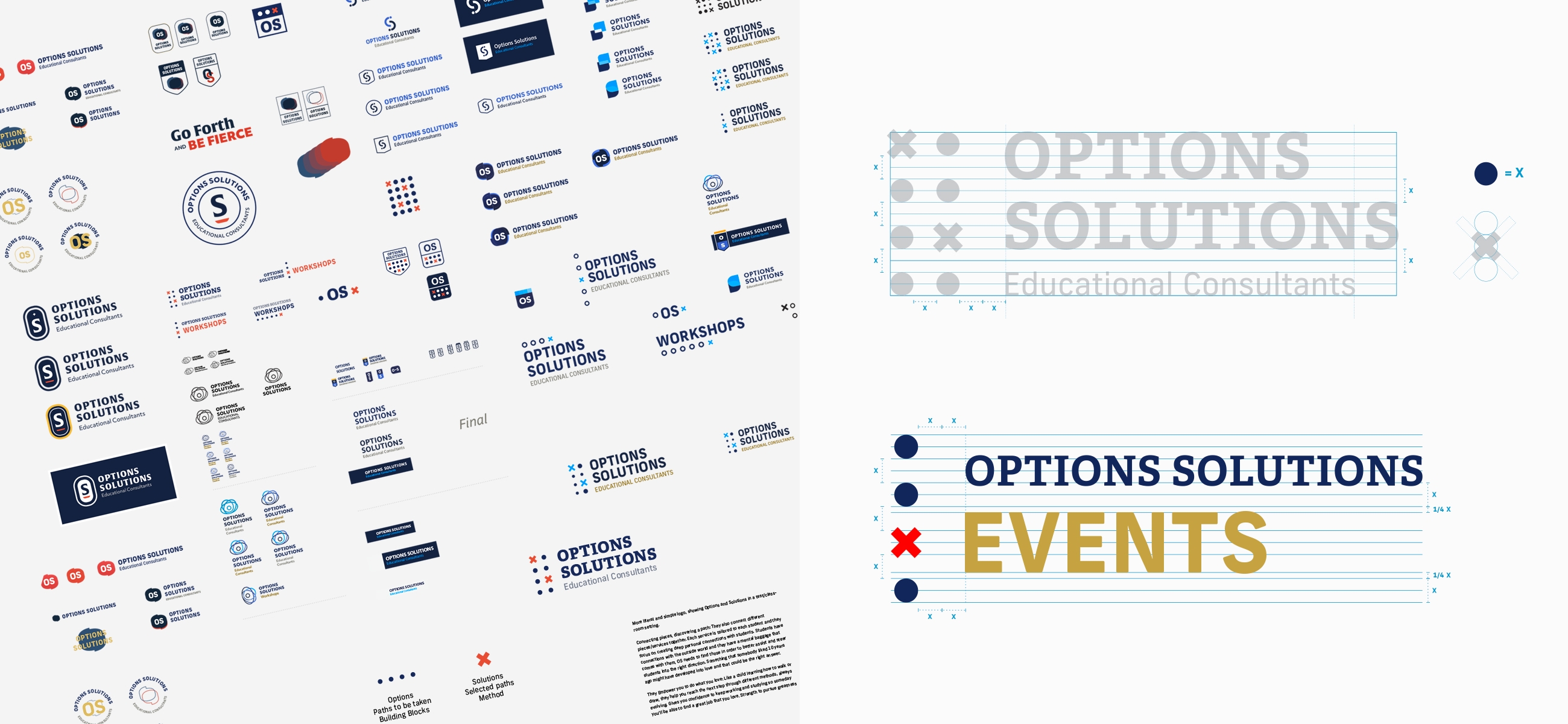

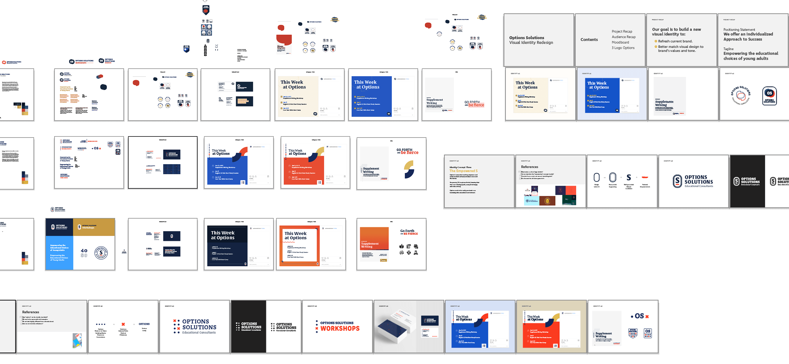

The final concept was called “Solutions for Options” and represented the materialization of the company name. The circles represent all the different paths students have to choose before graduating (the options), while the X represents the paths selected with confidence (the solutions). The final main typeface shows personality while being serious and slightly formal. The slab-serif typeface also makes a nod at the previous logo, which used a formal serif typeface.
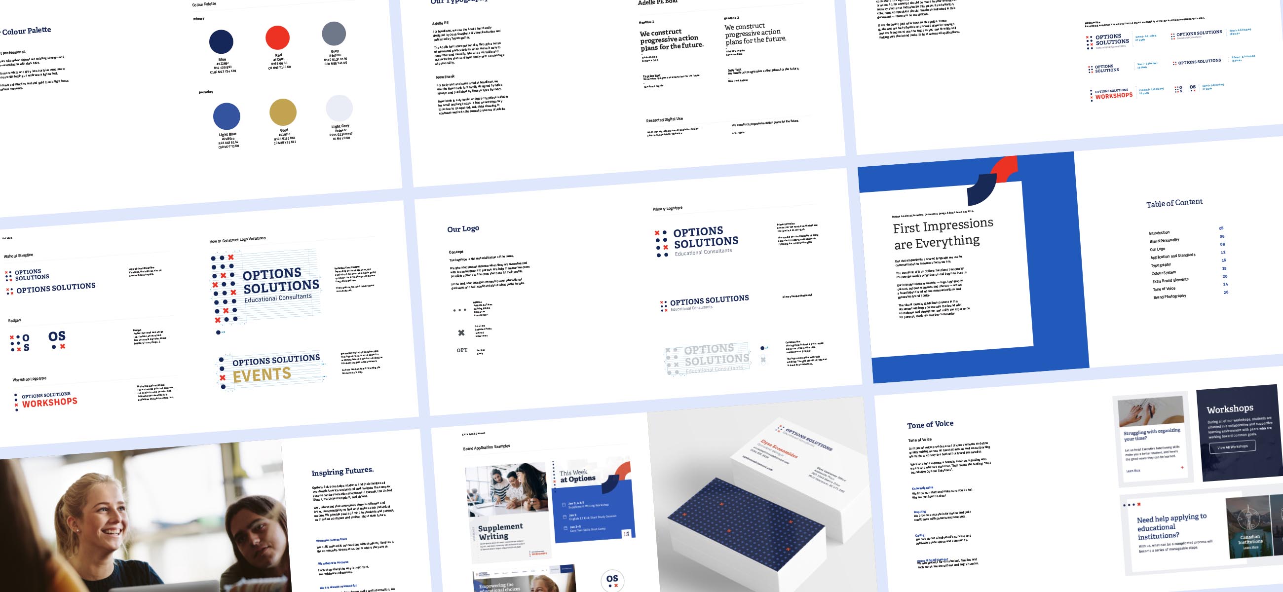
Included on launch was a brand book with the directions on how to apply the logo, how to construct variants of it, how to use images and what tone should be used in all brand touchpoints. Those guidelines have the purpose of elevating the brand equity for its audience and stakeholders.

WordPress Website Redesign
Applying all that was learned to the website
With the visual identity approved, we focused our attention on the website. Due to our Agile methodology, some of the website features were already implemented by our development team (features defined in the definition stage and in user stories), however, we still needed to define the website structure, architecture and look.
Business Goal
Continued business growth.
Marketing Goal
Obtain new clients through the website.
Website Goals
- Effective Usage of Brand Guidelines
- Scalable Platform to Support National Growth
- Establish Purpose & Value to New Audiences
- Purpose-Driven User Journey
- Drive Conversion for all Users

Effective Usage of Brand Guidelines
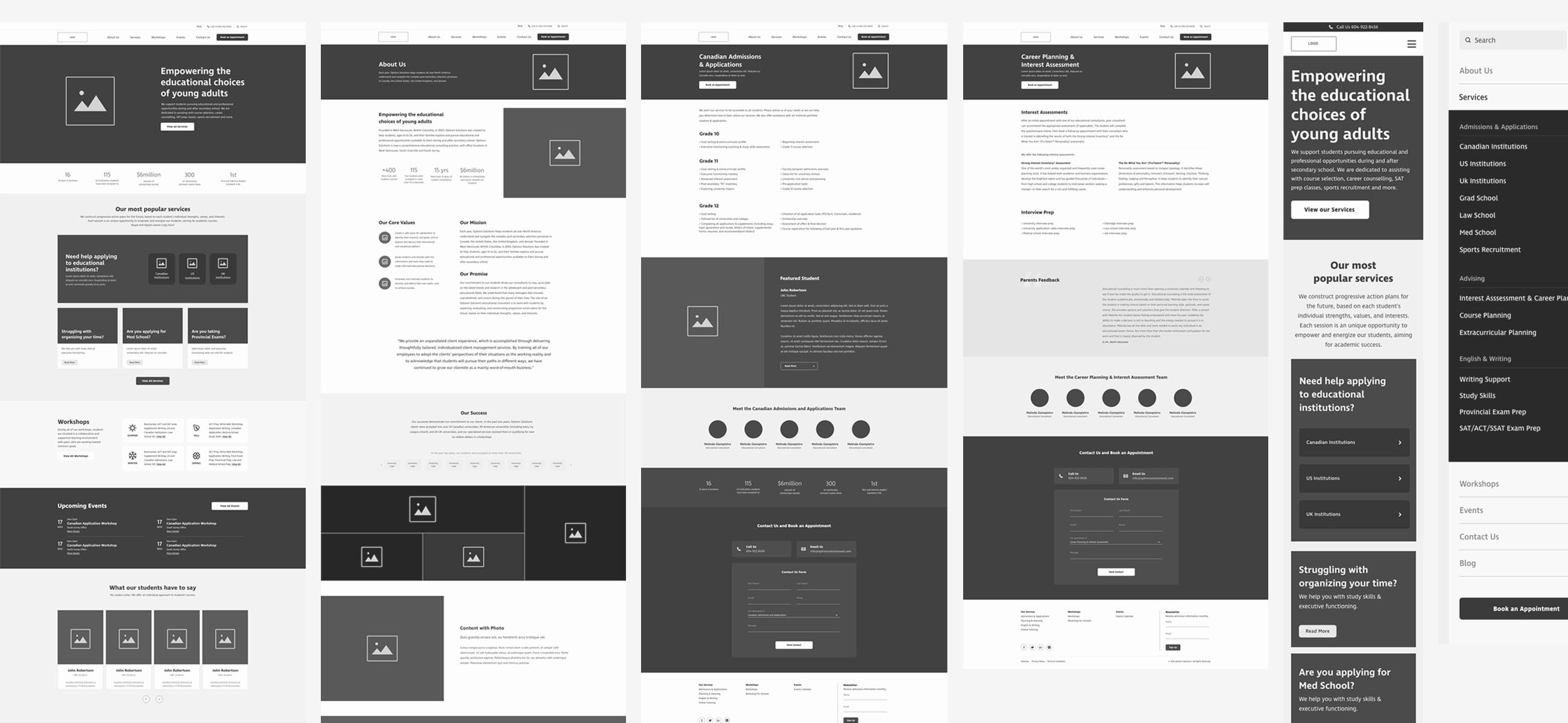
The brand guidelines and supporting elements were incorporated throughout the website creating an interface that tied the brand experience together. Since parents are the decision-makers, the goal was to keep it mostly professional and traditional while having some little hints of interesting elements to spark curiosity and reach younger audiences. The Home Page centralized the most important offerings Options had to offer and the Services menu was also totally remodelled into a Mega Menu in order to display and easily explain all services at once.


Scalable Platform to Support National Growth
During our interviews with key stakeholders, we learned that Options Solutions intended to scale its business across Canada. One of our key objectives quickly became to create a scalable platform to support national growth. We approached this with a mobile-first, high-performance, custom WordPress build to reduce page load times, and optimize the experience for users regardless of device.
Establish Purpose & Value to New Audiences
National Growth requires that the website must quickly establish purpose & value to new audiences unfamiliar with the concept of Educational Consulting. We explored user journeys to differentiate Ready-to-buy Users from Top-of-the-Funnel Users.
Purpose-Driven User Journey
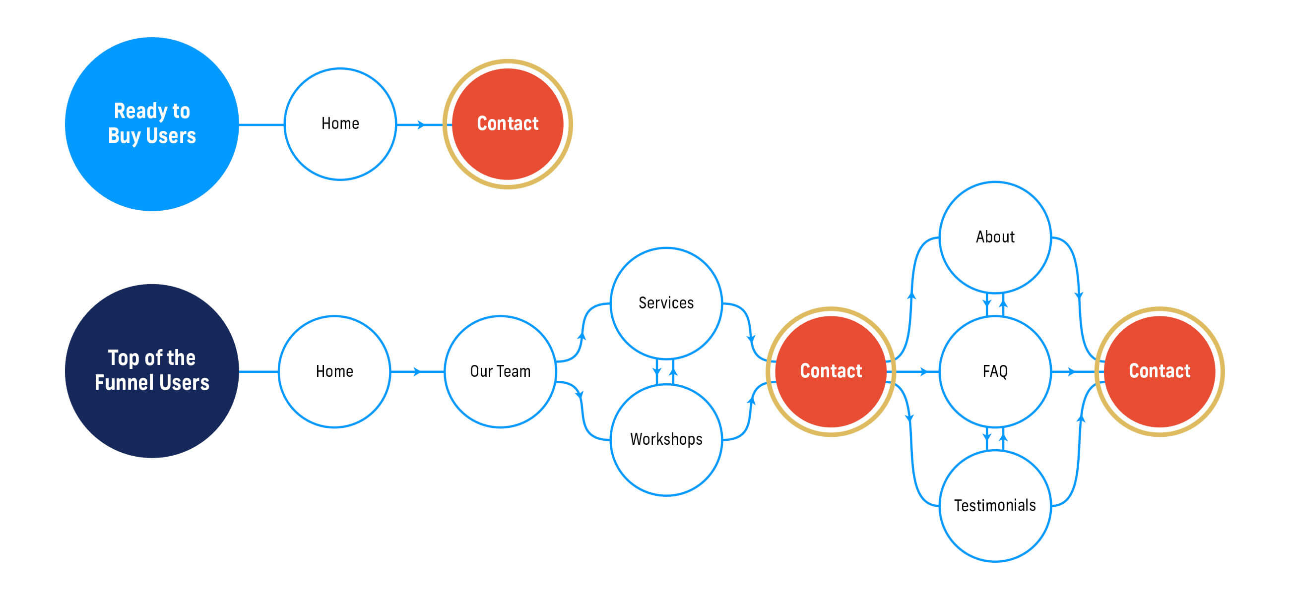
During our Research & Discovery phase, we closely monitored user journeys to understand user flow through the website. We used heat maps and user recordings to follow the journey. Typical user journeys looked like this:
The Ready to Buy Users
- Home or Contact
- Contact
The Top-of-the-Funnel User
- Home
- Our Team
- Services or Workshops
- Contact
- About or FAQ
- Testimonials
- Contact

Drive Conversion for All Users
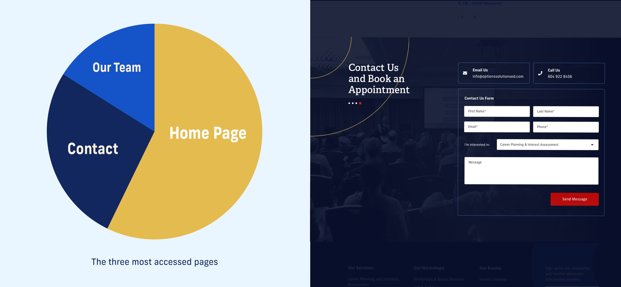
We noted that after the home page, the contact page was the most accessed page on the website. A contact form is now available on every page, and always available for Ready-to-Buy users.

We also optimized the journey for Top-of-the-Funnel users, or users unfamiliar with the concept of Educational Consulting and Options Solutions itself, who prefer to explore the site prior to moving to conversion. These users often start their journey on the Home page before moving to the Team page. Users continuing their journey then had to scroll to the top of the page to navigate to the next page. We identified this as a frustrating area and added sticky navigation to ease page switching.
The new Team pages features
- Related Services to guide users through their traditional route.
- Team members, which have been created as a reusable content type, automatically appear in Team Member sections, guiding users on a secondary route.
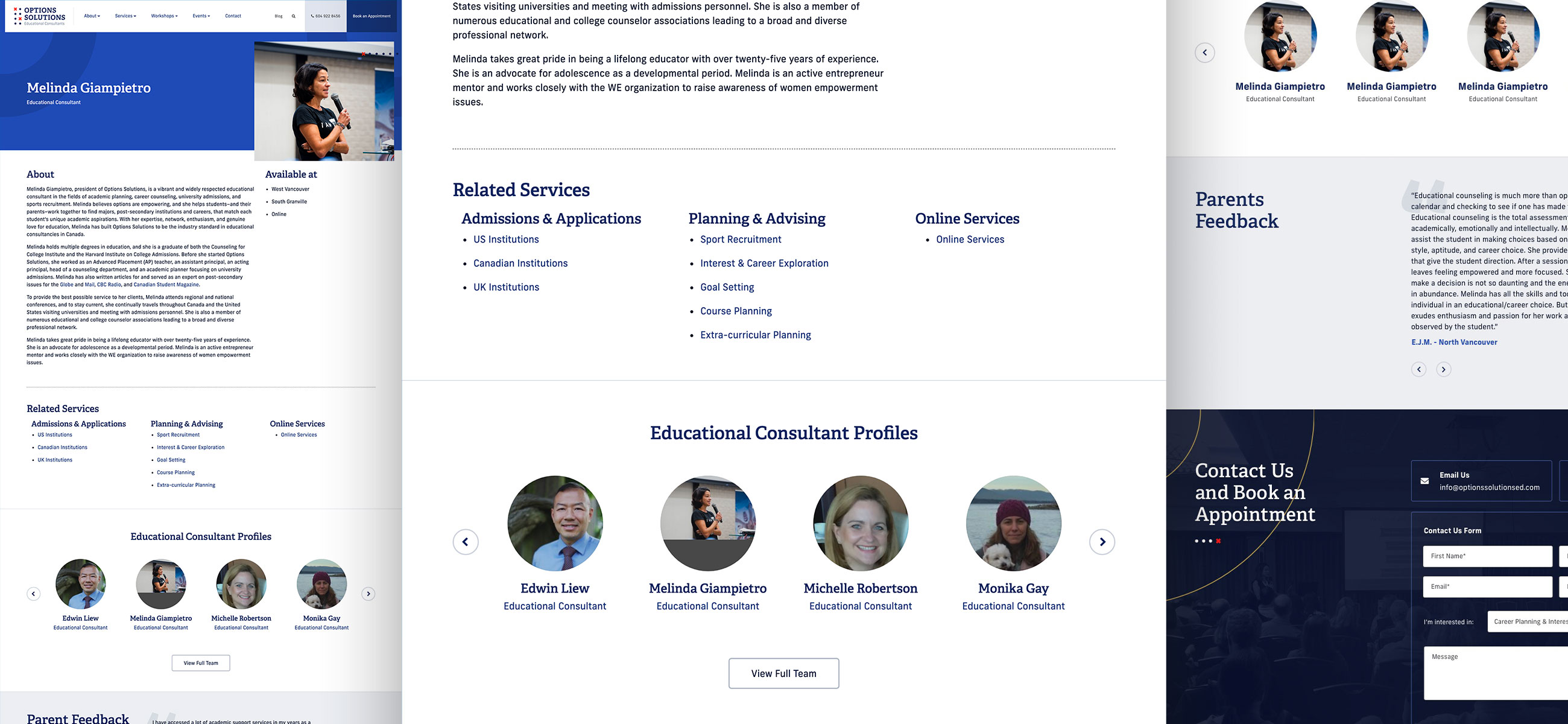

Service pages are typically the next stop in the Top-of-the-Funnel user’s journey. Reusable content (Related Team Members & relevant Testimonials) appears on Service pages to support the journey. Book an Appointment form is featured on the Service page for users that have converted to Ready-to-buy-Users.


Users that are not ready to convert continue on to the About Us page. The original About us section featured many pages, which we reduced to a single About Us page. The content on this page is structured by importance, as determined by page visits on the old site.
Summary
We love working with clients that are passionate about what they do! A strong foundation for a great digital strategy comes from a passionate team, with clearly defined business and marketing goals. We will continue to measure, iterate and produce strategic work for this amazing company.
Looking to migrate your website? Check out our Web Development services or Contact Us today!
